Posted on
April 2, 2025
by
Marie Taverna
Welcome to Bradley House at Windsor Gate. The lovely & very well-care for 2 bed & 2 bath condo is move in ready. From the moment you walk in you feel like your home. Gourmet kitchen with gas range, SS appliances, gleaming white cabinets & stone countertops. The living room & dining area are perfect for entertaining friends. Great balcony for warm weather chilling. Relax in the primary bedroom after a long day. 5-piece ensuite with double sinks. 3-piece main bath. In suite laundry. Enjoy the Nakoma Club, with fitness gym, basketball court, pool, hot tub, billiards table, party room & so much more. Minutes away from transit, park, coffee shop, schools, shopping. Make a date to view this home and make it yours.
Posted on
March 22, 2025
by
Marie Taverna
A well-designed laundry room is more than a luxury, it’s a game-changer for modern homes. Whether you’re looking to maximize efficiency, enhance aesthetics, or add functionality, renovating your laundry space can make a big impact. Here’s how to turn your laundry room into a space you’ll actually enjoy using. Plan your layout with purposeThe layout is the foundation of any laundry room redesign. Start by analyzing your space and determining the best placement for appliances and work areas. Stack or side-by-side appliances: If space is limited, consider stacking your washer and dryer to free up floor space. If you prefer side-by-side machines, use the top as a countertop for folding laundry. Accessibility: Make sure your appliances are close to water, electrical, and venting connections. Place frequently used items, like detergents, within arm’s reach to make your routine more efficient.
Pro Tip: A compact layout doesn’t mean compromising functionality. Condo-sized machines are perfect for tight spaces and still get the job done. Elevate storage and organizationA clutter-free laundry room is more functional and visually appealing. Incorporate smart storage solutions to keep everything organized. Cabinets and shelves: Install cabinets or floating shelves to store detergents, cleaning supplies, and linens. Hooks and wall storage: Use wall-mounted hooks or racks to hang brooms, mops, and ironing boards. This will free up floor space while keeping essentials easily accessible. Laundry basket storage: Dedicate a spot for baskets or hampers, like under a counter or on open shelving.
Pro Tip: Label shelves or bins to maintain an organized system that works for the whole family. Add functional workspacesHaving a work surface in your laundry room can make tasks like sorting, folding, and treating stains a lot easier. Countertops: Install a countertop over side-by-side machines for an instant workspace. Choose durable materials like quartz that can withstand wear and tear. Drying racks: Add a retractable drying rack or a rod for hang-drying clothes. This saves space and keeps damp clothes off your furniture.
Pro Tip: Include a deep utility sink for hand-washing delicate items or tackling messy stains. Choose durable and stylish materialsYour laundry room needs to stand up to frequent use and potential spills. Opt for materials that are easy to clean and maintain while adding style. Flooring: Go for water-resistant options like ceramic tile, porcelain, or luxury vinyl. Countertops: Non-porous surfaces like quartz are heat and stain-resistant, perfect for a hardworking space. Cabinets: Melamine is a durable and affordable option for cabinetry. Choose flat finishes that are easy to wipe down.
Pro Tip: Incorporate materials that match your home’s overall aesthetic for a cohesive look. Maximize small spaces with clever designIf your laundry room is on the smaller side, use these design tricks to make it feel more spacious. Pocket doors: Swap out a traditional door for a pocket door to save valuable wall space. Vertical storage: Utilize wall height by installing tall cabinets or shelving. Bright colours: Paint the walls in light, bright colours like crisp white or soft pastels to create the illusion of a larger space.
Pro Tip: Use reflective materials, like glossy tiles, to bounce light around the room. Brighten the room with lightingGood lighting can make a world of difference in a laundry room. Overhead task lighting: Install bright, even lighting to ensure you can see clearly when sorting and folding. Under-cabinet lights: Add task lighting under shelves or cabinets to illuminate work surfaces.
Pro Tip: If your laundry room lacks natural light, choose daylight-mimicking bulbs to brighten the space. Final touches: Style meets functionalityDon’t forget to add a personal touch to your newly redesigned laundry room. A stylish backsplash, decorative baskets, or framed art can make the space feel welcoming. Renovating your laundry room is an investment in both functionality and aesthetics. By focusing on layout, storage, and materials, you can create a space that works as hard as you do, and looks great while doing it.
Posted on
March 22, 2025
by
Marie Taverna
Homebuyers stayed on the sidelines in February 2025, leading to a significant drop in home sales across the country, according to the latest market report from the Canadian Real Estate Association (CREA). With the ongoing trade war between Canada and the United States, market activity slowed to its lowest level in over a year. Home sales see largest drop since 2022Sales activity fell 9.8% compared to January, marking the largest single-month decline since May 2022 and the lowest absolute number of home sales recorded since November 2023. The slowdown wasn’t limited to just a few areas — sales declined in about three-quarters of all local markets, with the most pronounced drop happening in the Greater Toronto Area and the surrounding Greater Golden Horseshoe region. “The moment tariffs were first announced on January 20, a gap opened between home sales recorded this year and last. This trend continued to widen throughout February, leading to a significant, but hardly surprising, drop in monthly activity,” said Shaun Cathcart, CREA’s Senior Economist, in the monthly report. “This is already being reflected in renewed price softness, particularly in Ontario’s Greater Golden Horseshoe region.” Market conditions in balanced territoryWhile home sales dropped, new listings also declined at a similar pace. As a result, the national sales-to-new listings ratio edged up slightly to 49.9%, compared to 48.3% in January. Historically, a balanced market sits between 45% and 65%. There were 146,250 properties listed on MLS® Systems at the end of February, marking a 13.1% increase from a year earlier. However, this number is still well below the long-term average for this time of year, which typically sits around 174,000 listings. Inventory levels also climbed, reaching 4.7 months of available homes on a national basis, up from 4.1 months in January. The long-term average for inventory is five months, suggesting the market is slowly shifting toward more choice for buyers. “The uncertainty of the last few weeks seems to be causing some buyers to think twice about big financial decisions right now,” said James Mabey, CREA’s Chair. “For others, a softer pricing environment and now lower interest rates will be a buying opportunity.” Home prices record decreaseThe National Composite MLS® Home Price Index (HPI) fell 0.8% from January to February. The softening in prices was particularly evident in Ontario’s Greater Golden Horseshoe region, where the decline was more pronounced. On an annual basis, the non-seasonally adjusted National Composite MLS® HPI was down 1% compared to February 2024.
Posted on
March 22, 2025
by
Marie Taverna
Welcome to Bradley House at Windsor Gate. The lovely & very well-care for 2 bed & 2 bath condo is move in ready. From the moment you walk in you feel like your home. Gourmet kitchen with gas range, SS appliances, gleaming white cabinets & stone countertops. The living room & dining area are perfect for entertaining friends. Great balcony for warm weather chilling. Relax in the primary bedroom after a long day. 5-piece ensuite with double sinks. 3-piece main bath. In suite laundry. Enjoy the Nakoma Club, with fitness gym, basketball court, pool, hot tub, billiards table, party room & so much more. Minutes away from transit, park, coffee shop, schools, shopping. Make a date to view this home and make it yours. OPEN HOUSES SATURDAY MARCH 22nd & SUNDAY MARCH 23rd 2:00-4:00. See you there!
Posted on
March 22, 2025
by
Marie Taverna
“The Shaughnessy” in West Coquitlam. Top floor condo unit has 2 bedrooms & 2 baths. Be impressed with the 15+ feet vaulted ceiling in the living room & wood burning fireplace. The living room & dining room are perfect spot for entertaining friends. Cute kitchen / Stainless Steel fridge & stove. Good size primary bedroom with walkthrough closet to in suite laundry. The 4-piece bath & a 2-piece bath flow together. Easy care tile floors thought most of unit. In suite storage or reno to a cute little office. Second bedroom or den.Enjoy many hours in the summer on your balcony among the tall trees. Centrally located to transit & shopping.SkyTrain is a short stroll away. Flat walking neighbourhood. 1 underground parking spot. Move in Spring 2025! OPEN HOUSE SATURDAY MARCH 22nd 2:00-4:00pm.
Posted on
March 16, 2025
by
Marie Taverna
In October 2025, a group of adventurous Royal LePage® Shelter Foundation™ champions from across Canada will travel to Cambodia to trek in support of women and children who have experienced intimate partner violence.
In October 2025, I’ll be heading to the other side of the globe to participate in the Cambodia Challenge for Shelter! For 5 days, I’ll be trekking alongside like-minded colleagues from coast to coast all in support of the Royal LePage Shelter Foundation. While my trek towards the picturesque temples of Angkor Wat will be immensely rewarding, it will not be easy! Days will be long, hot, and humid and jet lag will be intense. I will be going without the comforts of home, sleeping in a small tent, using rustic bathroom facilities and unplugging completely from cell service and technology.
To be eligible to take part, I will pay my own trek and travel expenses and must raise at least $6,000 for the Royal LePage Shelter Foundation. Of the funds I raise, 80% will be directed to my local women’s shelter and 20% will fund national domestic violence prevention programs. I was personally a victim of domestic violence in a past relationship. I know the feeling that exists out there for women. I know what it’s like to feel like you have no where to turn. I want to be not only a voice, but also a vehicle for change. I want to change and better the lives of women and children who are affected by domestic violence. I know the adventure ahead will test me both physically and emotionally, but I’ve raised my hand because I believe that a house is only a home when the people who live there feel safe. As I face this challenge, I will draw strength knowing that every dollar I raise and every kilometer I walk will help make it easier for women and children to find the safety, hope and healing they deserve. Will you join me by making a donation towards my fundraising goal? Please click 'Donate Now' on the right hand side of this page to help me reach my fundraising goal! Thank you for your support! Please note: The Royal LePage Shelter Foundation issues tax receipts in February for all donations of $20 or more made in the previous calendar year.
Posted on
March 13, 2025
by
Marie Taverna
Welcome to Bradley House at Windsor Gate. The lovely & very well-care for 2 bed & 2 bath condo is move in ready. From the moment you walk in you feel like your home. Gourmet kitchen with gas range, SS appliances, gleaming white cabinets & stone countertops. The living room & dining area are perfect for entertaining friends. Great balcony for warm weather chilling. Relax in the primary bedroom after a long day. 5-piece ensuite with double sinks. 3-piece main bath. In suite laundry. Enjoy the Nakoma Club, with fitness gym, basketball court, pool, hot tub, billiards table, party room & so much more. Minutes away from transit, park, coffee shop, schools, shopping. Make a date to view this home and make it yours. OPEN HOUSES SATURDAY MARCH 15th 11:00am-1:00pm & SUNDAY MARCH 16th 2:00pm-4:00pm
Posted on
March 13, 2025
by
Marie Taverna
Imagine living at “The Fairways” with a beautiful golf course across the road.Enjoy a day of golf before heading home to your top floor home to relax on your balcony overlooking the garden. Lovely 2 bed & 2 bath condo is move-in ready. From the moment you walk in you will feel like your home. Bright living room with electric fireplace.Fabulous kitchen with centre island, wooden cabinets, SS appliances & more.Den could be an office/dining area or lounge area. Primary suite with walk through closet to your lovely 5-piece bath. Large 2nd bedroom for guests or children. Newer laminate flooring in main area.Large laundry room with extra storage space.2 side by side parking spots & 1 storage unit. Transit, shopping & great restaurants are close-by. “Fore” a date to view, call your Realtor today.
Posted on
March 13, 2025
by
Marie Taverna
The 25 basis point cut marks the seventh consecutive time Canada’s central bank has dropped ratesOn March 12th, the Bank of Canada announced that it had lowered the target for the overnight lending rate by 25 basis points to 2.75%. This marks the seventh consecutive decrease to rates since June 2024. In its announcement, the Bank acknowledged that the Canadian economy had started the year on good footing. Now, with a trade war underway with the United States, the country is expected to see slower economic activity and increasing inflationary pressures in the months ahead, justifying the central bank’s decision to reduce its policy rate yet again. “[In recent] months, the pervasive uncertainty created by continuously changing US tariff threats has shaken business and consumer confidence. This is restraining household spending intentions and businesses’ plans to hire and invest. Against this backdrop, and with inflation near the 2% target, [the] Governing Council decided to reduce the policy rate a further 25 basis points,” said Tiff Macklem, Governor of the Bank of Canada, in a press conference with reporters following the announcement. “Looking ahead, the trade conflict with the United States can be expected to weigh on economic activity, while also increasing prices and inflation. Governing Council will proceed carefully with any further changes to our policy rate given the need to assess both the upward pressures on inflation from higher costs and the downward pressures from weaker demand.” In January, Canada’s Consumer Price Index (CPI) rose 1.9% on a year-over-year basis, a slight increase from 1.8% in December. Higher gasoline and energy prices contributed to the modest uptick to the inflation rate, which remains under the Bank’s 2% inflation target. Inflation is expected to increase to 2.5% in March as relief from the GST/HST tax break subsides. Lower borrowing rates to boost buying power this springTrade disputes with the United States are likely to dampen activity within the housing market as economic uncertainty causes consumers to pull back. However, those already in the market and motivated to buy a home, or those expecting to renew their mortgage this spring, may find a silver lining – lower borrowing costs. “For the seventh consecutive time, the Bank of Canada has dropped its overnight lending rate. In an increasingly turbulent economic environment, this series of rate decreases presents an opening to aspiring homebuyers and those approaching their mortgage renewal,” said Phil Soper, president and CEO of Royal LePage. “While ongoing trade tensions will sow hesitancy in the minds of some consumers, purchasers who are motivated to transact this spring are well-positioned to use their enhanced borrowing power to their advantage, in a market with more inventory to choose from. “With substantial tariffs from the United States set to come into effect, Canada’s central bank will likely focus its attention on stimulating the economy and steering us away from a recession. Additional rate cuts may be on the horizon as policymakers work to maintain stability. The housing market, while it may see a temporary slowdown in activity, remains largely insulated from trade disputes, ensuring its resilience in the long term.” According to a recent Royal LePage survey, conducted by Hill & Knowlton,1 more than half (57%) of Canadians who are renewing the mortgage on their primary residence in 2025 expect their monthly mortgage payment to increase upon renewal (35% expect it to increase slightly and 22% expect it to increase significantly). Meanwhile, 25% say their monthly mortgage payment will remain about the same – within $100 of their current payment amount – and another 15% expect their monthly payment to decrease upon renewal. The Bank of Canada will make its next interest rate announcement on Wednesday, April 16th. Read the full March 12th report here.
Posted on
March 9, 2025
by
Marie Taverna
A new national report from Women’s Shelters Canada, funded proudly by the Royal LePage® Shelter Foundation™, has shed light on the effects of a housing crisis on women fleeing intimate partner violence at local shelters and transition houses from coast to coast. Among survey respondents – which included individuals working in shelters and survivors accessing support – 99.5% felt that their community was facing a housing crisis, with 97% indicating that over the preceding year it had become harder to support survivors to find housing. “These findings have confirmed what we’ve been hearing anecdotally from women’s shelters across the country for years,” said Anuradha Dugal, executive director of Women’s Shelters Canada and Board Member of the Royal LePage Shelter Foundation. “Since there’s no affordable housing, women are staying in shelters longer, which increases turn-away rates. It creates a bottleneck effect where new women can’t move in if women already in shelter have nowhere to go.” While the majority of organizations surveyed have length of stay policies, only 3% abide by those timelines. Worryingly, compared to 2023, respondents reported that more survivors are leaving shelter for housing that does not meet their needs, is not safe, is unaffordable, and/or often contributes to cycling back into a shelter. Alarmingly, some survivors are choosing to return to abusers rather than face homelessness. When survivors are faced with such decisions, their stress escalates, and their well-being suffers; 92% of respondents had seen survivors’ stress increase due to the housing crisis. Yet despite all the challenges, shelters continue their lifesaving work by offering a range of supports to help women find housing and advocate for more housing options for survivors. Some organizations are responding to the housing crisis and the demand for shelter services by working to expand the number of units and/or shelters across the country. “Housing affordability is a deeply relevant issue for Royal LePage® professionals working to help Canadians in all corners of our country achieve their dream of home ownership,” said Lisa Gibbs, executive director of the Royal LePage Shelter Foundation. “While the situation is complex, we are hopeful that this nuanced report will help continue to move the needle in ensuring access to safe and affordable housing for everyone – especially those among us who are most vulnerable.” Visit rlp.ca/donate to join the Royal LePage Shelter Foundation in its work to make home a safe place for everyone.
Women’s Shelters Canada brings together 16 provincial and territorial shelter organizations and supports over 600 shelters across the country for women and children fleeing violence. If you or someone you know is experiencing violence, you can find your nearest women’s shelter and its crisis line at sheltersafe.ca.
Posted on
March 9, 2025
by
Marie Taverna
When it comes to decorating your home, style doesn’t have to come at the expense of practicality. With a little thought, planning, and intention, you can create a beautiful space that’s also easy to maintain. Here are some simple, stylish ideas for a home that looks great and stays clean with minimal effort: Opt for Washable Paint Finishes
Gloss or satin finishes are your best friend in high-traffic areas. They’re more durable and can easily be wiped down without damaging the paint. Whether it’s fingerprints in the kitchen or scuffs in the hallway, a washable finish will keep your walls looking fresh. Choose Slipcovers or Washable Fabrics
Furniture can endure a lot of wear, especially in busy homes. Slipcovers are not only easy to remove and wash, they also give your furniture a fresh, updated look. Choose fabrics like cotton, linen, or performance blends that stand up to wear and are machine washable. Invest in Durable Flooring
Engineered hardwood, porcelain or ceramic tile, and luxury vinyl plank are beautiful and durable choices. They can typically handle spills, pet accidents, and constant foot traffic, all while looking sleek and modern. Opting for washable rugs in high-traffic areas can be especially helpful if you have kids or pets. They’re easy to clean and will help protect your flooring while still adding comfort and style. Keep Surfaces Simple
Smooth, sleek surfaces are easier to wipe down than textured or overly detailed ones. Choose tables, counters, and shelving that are simple and practical, without too many crevices that can trap dirt. Designing a stylish home that’s also easy to maintain is all about finding the balance between aesthetics and function.
Posted on
March 9, 2025
by
Marie Taverna
Spring is here, and while the season brings warmer weather, it also brings a rise in allergens. From pollen to mold, allergens can quickly make their way indoors and affect your health and well-being. Here are some simple steps to help keep your home allergen-free this season: Manage Pollen: Start by washing your windows and wiping down surfaces regularly to remove pollen. Keep windows closed during peak pollen times, and change your air filters to keep your HVAC system clean. Combat Mould and Mildew: Spring moisture can lead to mould growth. Keep your home well-ventilated, and use a dehumidifier in high-moisture areas like bathrooms and basements. Check for any mould in corners or hidden areas. Clean Dust Mites: Dust mites thrive in warm, humid conditions. Wash bedding, rugs, and curtains frequently in hot water. Vacuum your mattress and consider using allergen-proof covers for pillows and mattresses. Limit Pet Dander: If you have pets, regular grooming and bathing can help minimize dander. Be sure to clean pet bedding and toys often and use an air purifier designed to capture dander. Install an Air Purifier: Consider using an air purifier with a HEPA filter to remove airborne allergens like pollen, dust, and pet dander, and keep the air fresh. By following these simple tips, you and your family can breathe easier this spring.
Posted on
March 9, 2025
by
Marie Taverna
Spring is the perfect time for a getaway. But before you pack your bags and hit the road, don’t forget to prep your home for your time away. Knowing your home is secure and free from surprises will give you the peace of mind to unplug and enjoy your vacation. Your Spring Travel Home Prep Checklist: Lock it Down: Double-check all windows and doors to ensure they’re securely locked. Consider installing a smart security system for extra protection while you’re away. Don’t forget to secure any high-value items that might be left in plain sight. If you can, use a safe or lock them in a drawer to keep them out of view. Refrigerator Prep: Clean out perishables from the fridge to prevent unwanted odours or spills. You might also want to wipe down any food storage areas to avoid attracting pests while you’re away. Adjust Your Thermostat & Unplug Devices: Save energy (and money!) by setting your thermostat a few degrees lower. Be sure to unplug unnecessary electronics and appliances to avoid power surges and save even more energy. Turn Off Water Valves: Prevent any leaks or water damage by turning off the main water supply before you leave. Lighting: Using timers to turn lights on and off gives the appearance that someone is home. This is an easy way to deter unwanted attention. Tell a Trusted Neighbour or Friend: Let someone nearby know you’ll be away, so they can keep an eye out for any suspicious activity, help with emergencies, or even collect packages that might be left at your door. Consider a Home Audit: This is a great time to walk through your house and look for any small maintenance issues that could turn into bigger problems while you’re gone—like a leaky faucet or loose roof shingles. With a little preparation, you can head off on your spring getaway with reassurance knowing your home is safe and secure. For more expert advice on keeping your home safe, efficient, and ready for anything, check out the Royal LePage Blog, blog.royallepage.ca.
Posted on
March 9, 2025
by
Marie Taverna
According to the Royal LePage® House Price Survey released today, the aggregate1 price of a home in Canada increased 3.8 per cent year over year to $819,600 in the fourth quarter of 2024. On a quarter-over-quarter basis, the national aggregate home price remained essentially flat, rising a modest 0.5 per cent. When broken out by housing type, the national median price of a single-family detached home increased 4.9 per cent year over year to $855,900, while the median price of a condominium increased 1.5 per cent year over year to $592,700. While activity began to flourish again in the final months of 2024, following sluggish demand in most major markets over the summer, home price appreciation remained in check last quarter. “There are several converging factors revitalizing Canada’s real estate market and making home ownership more attainable,” said Phil Soper, president and CEO, Royal LePage. “Interest rates have fallen sharply in recent months, with further reductions expected in 2025. At the same time, new mortgage rules are already helping younger Canadians by increasing borrowing power and reducing monthly carrying costs. “Year over year activity levels were up sharply in Canada’s largest cities during the fourth quarter, with national home sales volumes exceeding the ten-year moving average for the first time since the post-pandemic market slowdown began three years ago,” said Soper. “As sidelined buyers regained confidence and took advantage of improved affordability, momentum built steadily through the final months of 2024. “We expect stronger demand to persist through the winter, setting the stage for an early and active spring season,” continued Soper. “Home prices are likely to trend only modestly upward over the coming year as inventory is absorbed. This is welcome news for buyers, who can look forward to a more balanced market compared to the frenzied conditions of 2021 and 2022.” Royal LePage is forecasting that the aggregate price of a home in Canada will increase 6.0 per cent in the fourth quarter of 2025, compared to the same quarter last year. 1 Aggregate prices are calculated using a weighted average of the median values of all housing types collected. Data is provided by RPS Real Property Solutions and includes both resale and new build. Learn more:
Posted on
March 9, 2025
by
Marie Taverna
At first, your home may have felt like true love – the perfect match, full of excitement and possibility. But as time goes on, the honeymoon phase can fade. Maybe you’re craving more space, a shorter commute to work or school, or modern features that other homes seem to have. If you’re feeling restless, you might be wondering, “Is it time for a fresh start, or can this relationship be saved with a little TLC?” Deciding whether to move to a new home or renovate the one you’ve got is no small decision — it’s a mix of emotions, finances, and practicality all rolled into one. Think of it like the HGTV classic Love It or List It: weighing the pros and cons of both options to figure out what truly fits your family and lifestyle. This guide will help you determine if your home is still “the one” or if it’s time to move on. Top reasons to renovate your homeIf you love your neighbourhood, have sentimental attachments to your home, or see potential in upgrading your space, renovating might be the better option. Here’s when improving makes sense: 1. Your home has good bonesIf your home is structurally sound and doesn’t require major foundational work, a renovation could be a cost-effective way to address your needs. Open up your floor plan, update outdated features, or add square footage to create a home that feels brand new. 2. You love your locationIf your home is in a desirable neighbourhood, close to work, or within a top school district, improving your home allows you to enjoy these benefits while adapting your space to meet your needs. 3. Renovations increase valueConsider renovations that will add significant value to your property. Projects like modernizing the kitchen, updating bathrooms, or adding energy-efficient upgrades often provide a good return on investment. 4. Moving costs are prohibitiveBetween realtor fees, closing costs, and moving expenses, relocating can be expensive. If your renovation budget is less than the cost of moving, it might make more financial sense to stay put. Top reasons to move to a new homeSometimes, no amount of renovation can fix a home that no longer suits your lifestyle. Here’s when moving to a new property may be the better option: 1. Space is limitedIf your family has outgrown your current home and there’s no room to expand, or zoning restrictions make it impossible to do so, moving to a larger property may be the best solution. 2. Your needs have changedLife changes – like a growing family, a new job, or aging parents moving in – may make your current home impractical. In these cases, finding a home that meets your new needs can be more effective than extensive renovations. 3. Renovations are too costlyIf the renovations required to make your home suitable are extensive and expensive, the ROI might not justify the investment. In this case moving may be more cost-effective. 4. You’re ready for a changeSometimes, the desire for a fresh start or a completely different style of home outweighs the convenience of staying. If you’re feeling uninspired or constrained in your current home, it might be time to explore new options. Key questions to help you decide whether to renovate or relocateStill stuck between renovating and relocating? Here are a few crucial questions to ask yourself to find an answer. 1. What’s my budget? Compare the costs of renovating versus moving. Don’t forget to factor in hidden costs like permits, temporary housing, or realtor fees. 2. How disruptive will renovations be? Living through major renovations can be stressful and time-consuming. Consider whether you have the time and patience for the process. 3. Will I get the features I want? If your renovation can’t deliver your dream home, moving may be the better choice. 4. How long do I plan to stay? If you plan to stay in your current home for many years, renovations could be a worthwhile investment. If not, moving might make more sense. How we can support your decisionThe choice between moving and improving is deeply personal and depends on your unique situation. By evaluating your needs, budget, and long-term goals, you can make a decision that works best for you and your family. Whether you decide to renovate or relocate, having the right team on your side makes all the difference. Royal LePage professionals specialize in helping homeowners navigate these pivotal decisions. From finding trusted contractors to discovering your dream home, they’re here to guide you every step of the way.
Posted on
March 9, 2025
by
Marie Taverna
More than half of Canadian borrowers anticipate their monthly mortgage payment to increase upon renewal in 2025More than a million Canadian mortgages will come up for renewal this year. Though interest rates have been on the decline for the last several months, many borrowers are bracing for an increase to their monthly payment – an adjustment that could be quite steep for some households. According to a recent Royal LePage survey, conducted by Hill & Knowlton,1 more than half (57%) of Canadians who are renewing the mortgage on their primary residence in 2025 expect their monthly mortgage payment to increase upon renewal (35% expect it to increase slightly and 22% expect it to increase significantly). Meanwhile, 25% say their monthly mortgage payment will remain about the same – within $100 of their current payment amount – and another 15% expect their monthly payment to decrease upon renewal. “When it comes to post-pandemic mortgage renewals, many Canadians have avoided the worst-case scenario of having to sell their homes due to the inability to cover the cost of their mortgage, thanks to solid employment trends and declining interest rates,” said Phil Soper, president and CEO, Royal LePage. “Nevertheless, some will face a substantial rise in their mortgage costs, putting added pressure on their household finances. Many in this situation are exploring options to lower their monthly fees, such as extending their amortization period; a tactic which has proven popular.” Of those who expect their monthly mortgage payment to rise upon renewal, 81% say the increase will put financial strain on their household; 47% expect a slight strain, while 34% expect a significant strain. Though many Canadians will see their monthly mortgage payment rise this year, most see no reason to make preemptive major lifestyle changes to cope with increased housing expenses. A majority (62%) of respondents say they will not change their living arrangements to avoid potentially higher monthly mortgage costs. Respondents in Quebec were the most likely to say they will not adjust their living arrangements (78%), while those in Alberta were the least likely to say so (53%). Nationally, however, 11% say they are considering relocating to a more affordable region; 10% say they are considering downsizing; and 10% say they are considering renting out a portion of their home to subsidize expenses. Respondents were able to select more than one answer. Variable-rate mortgages rise in popularityWith interest rates on a downward trajectory, variable-rate mortgages are gaining in popularity. According to the survey, 66% of Canadians with a mortgage renewing this year say they plan to obtain a fixed-rate loan upon renewal (down from the 75% who currently hold fixed-rate mortgages), and 29% say they will choose a variable-rate loan (up from the 24% who currently hold variable-rate mortgages). While most Canadians with pending renewals in 2025 plan to stick with the same type of mortgage product they currently have, a sizable shift toward variable-rate loans has emerged. Of those who currently have a fixed-rate mortgage renewing this year – the most popular mortgage product overall in Canada – 20% say they will switch to a variable-rate loan. Seventy-six per cent say they intend to renew with another fixed-rate loan. Meanwhile, 61% of current variable-rate mortgage holders intend to renew with another variable-rate loan, and 37% say they will switch to a fixed rate. 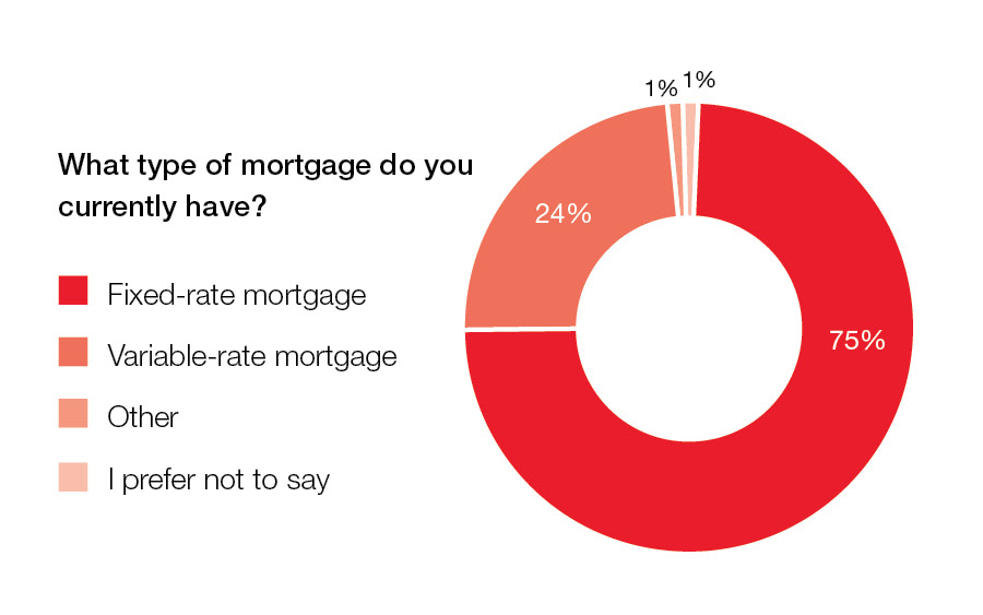 “Since last summer, the Bank of Canada has made several cuts to its overnight lending rate amounting to a decline of 200 basis points thus far, driving variable mortgage rates down in tandem. For homeowners looking to reduce their monthly payments or pay down their principal faster, variable-rate mortgages have become an increasingly attractive option in light of today’s declining rate environment and the likelihood of further cuts this year,” added Soper. “Ultimately, Canadians should choose the mortgage product that best suits their financial goals and risk tolerance.” Read the full press release and review the data chart for more information and regional insights: PRESS RELEASE DATA CHART
Royal LePage resources for those renewing their mortgage
Posted on
March 9, 2025
by
Marie Taverna
Move in by Spring 2025! The “TERRACES” CUTE 1 bed & den unit, perfect for a 1st time buyer or empty nester wanting to downsize, or anyone in between .From the moment you walk in you will love the nature light streaming in.Large living room with wood burning fireplace. Sliders to balcony facing south & enjoy view to Metro Town. Cozy kitchen with stain glass window. Dining room with retro light fixture. Good size primary bedroom with walk through closet to 4-piece bath. Bonus, den/office/guest bedroom/shoe closet, you decide! Laundry closet, just add washer & dryer. Also a shared laundry room in the building. Easy care flooring.1 parking spot.1 Locker on the same floor as unit. Transit, shopping & recreation close by. Great for students commuting to SFU or BCIT. Book a first date to view this condo. Was listed at $515,000.00
Posted on
March 9, 2025
by
Marie Taverna
After a 46 per cent year-over-year increase of new listings in January, the number of newly listed properties on the MLS® in Metro Vancouver* rose more moderately in February helping keep market conditions in balanced territory.
The Greater Vancouver REALTORS® (GVR) reports that residential sales in the region totalled 1,827 on Metro Vancouver’s Multiple Listing Service® (MLS®) in February 2025, an 11.7 per cent decrease from the 2,070 sales recorded in February 2024. This total was 28.9 per cent below the 10-year seasonal average (2,571).
“After the rush of new listings in January, home sales and new listings in February were closer to historical averages, which has positioned the overall market in balanced conditions,” Andrew Lis, GVR’s director of economics and data analytics said. “With a potential Bank of Canada rate cut on the table for mid-March, homebuyers may find slightly improved borrowing conditions while enjoying the largest selection of homes on the market since pre-pandemic times.”
There were 5,057 detached, attached and apartment properties newly listed for sale on the MLS® in February 2025. This represents a 10.9 per cent increase compared to the 4,560 properties listed in February 2024. This was 11.6 per cent above the 10-year seasonal average (4,530).
The total number of properties currently listed for sale on the MLS® system in Metro Vancouver is 12,744, a 32.3 per cent increase compared to February 2024 (9,634). This is also 36.4 per cent above the 10-year seasonal average (9,341).
Across all detached, attached and apartment property types, the sales-to-active listings ratio for February 2025 is 14.8 per cent. By property type, the ratio is 10.7 per cent for detached homes, 18.5 per cent for attached, and 16.8 per cent for apartments.
Analysis of the historical data suggests downward pressure on home prices occurs when the ratio dips below 12 per cent for a sustained period, while home prices often experience upward pressure when it surpasses 20 per cent over several months.
“Balanced market conditions typically bring a flatter price trajectory, and we’ve seen prices across all segments remain in a holding pattern for the past few months,” Lis said. “But with the active spring season just around the corner, it will be interesting to see whether buyers take advantage of some of the most favorable market conditions seen in years, and whether sellers change their willingness to bring their properties to market.”
The MLS® Home Price Index composite benchmark price for all residential properties in Metro Vancouver is currently $1,169,100. This represents a 1.1 per cent decrease over February 2024 and a 0.3 per cent decrease compared to January 2025.
Sales of detached homes in February 2025 reached 477, a 14.8 per cent decrease from the 560 detached sales recorded in February 2024. The benchmark price for a detached home is $2,006,100. This represents a 1.8 per cent increase from February 2024 and is virtually unchanged compared to January 2025.
Sales of apartment homes reached 976 in February 2025, a 10.6 per cent decrease compared to the 1,092 sales in February 2024. The benchmark price of an apartment home is $747,500. This represents a 2.8 per cent decrease from February 2024 and a 0.1 per cent decrease compared to January 2025.
Attached home sales in February 2025 totalled 359, a 10.9 per cent decrease compared to the 403 sales in February 2024. The benchmark price of a townhouse is $1,087,100. This represents a 1.2 per cent decrease from February 2024 and a 1.7 per cent decrease compared to January 2025.
| | Download GVR's February 2025 MLS® stats package |
Posted on
February 13, 2025
by
Marie Taverna
Welcome to “The Shaughnessy” in West Coquitlam. This top floor condo unit has two bedrooms & two baths. You will be impressed with the 15+ feet vaulted ceiling in the living room & wood burning fireplace. The living room & dining room are perfect spot for entertaining friends. Cute kitchen with Stainless Steel fridge & stove. Good size primary bedroom with walkthrough closet to in suite laundry. The four-piece bath & a two-piece bath flow together. Easy care tile floors thought most of unit. In suite storage or reno to a cute little office. Second bedroom or den. Enjoy many hours in the summer on your balcony among the tall trees. Centrally located to transit and shopping. The SkyTrain is a short stroll away. Flat walking neighbourhood. One underground parking spot. OPEN HOUSES SATURDAY FEBRUARY 15th & SUNDAY FEBRUARY 16th from 2:00-4:00pm. See you there!
Posted on
February 10, 2025
by
Marie Taverna
SURREY, BC – Growing inventory and stable prices could lead to opportunities for buyers in the Fraser Valley market this winter despite uncertain economic conditions. Newly listed homes jumped 167 per cent from December to January, with 3,432 listed on the Fraser Valley Real Estate Board’s Multiple Listing Service® (MLS®). At 7,251 active listings, inventory is at a 10-year seasonal high, 54 per cent above the 10-year average. While sales remained slow in January, with 818 properties sold (down 18% from December), the combination of stable prices and abundant selection presents potential opportunities for buyers to get back into the market. The sales-to-active listings ratio appears to bear this out. At 11 per cent, the overall ratio is signaling a buyer’s market, with detached homes firmly in buyer’s market territory. The market is considered to be balanced when the ratio is between 12 per cent and 20 per cent. It took longer to sell homes in January compared to December. Across the Fraser Valley, the average number of days to sell a single-family detached home was 52, while for a condo it was 42. Townhomes took, on average, 38 days to sell. “The market appears to be in a holding pattern at the moment,” said Baldev Gill, CEO of the Fraser Valley Real Estate Board. “There is no doubt that economic uncertainty is playing a role, especially the spectre of a trade war, which could lead to even more rate cuts by the Bank of Canada. The confluence of these conditions could provide unique buying opportunities, but we urge buyers and sellers to work with a REALTOR® to ensure they align with financial objectives.” Benchmark prices in the Fraser Valley held relatively steady in January, with the composite Benchmark price down 0.03 per cent to $964,800. To read the full statistics package, click here.
|
 Subscribe with RSS Reader


